Our Titles
We took ideas from a few different trailers, focusing on those involving possession.
The background gives that creepy vintage feel as the colours used are usually something you'd relate with the 'olden days'. The motion background picture is something we feel is very effective, we intended the swirl that creeps oto the screen to reflect the actions of the main character in the trailer, Samara Wood, and the creeping and unexpectedness of the possessions that take place. We chose a bold font for our titles so that they stood out clearly from the background motion picture as we didn't want the pattern moving in the background to be too distracting. The colour oft he font is a gone off white colour, which we thought mirrored our main storyline of possession. Stereotypically older things (surroundings) or places that have a history are more likely to be possessed or surrounded by unwanted spirits, this is why we wanted the title to not be a distinct white, but with a tinged of yellow to it to give an olden effect.
After watching our final product once complete, we found that the titles didn't fit and flow as well as we firth thought they would. We decided to change them so they were darker, and had more movement to them, hoping this would solve the problem of the not flowing well. We searched many different images that we felt could fit in well and decided to have a panning camera shot showing photo frames, in a poorly lit room. This gave more of a sinister feel.
|
|
|
Taglines
A tagline is a vital important part of any trailer, as that line or few sentances is the thing that the audience will remember and be able to associate with the film. After brainstorming many ideas we decided to use 'Your Soul She'll Hold Forever More' as we felt it would be more appropriate for a film within the paranormal genre.
|
|
|
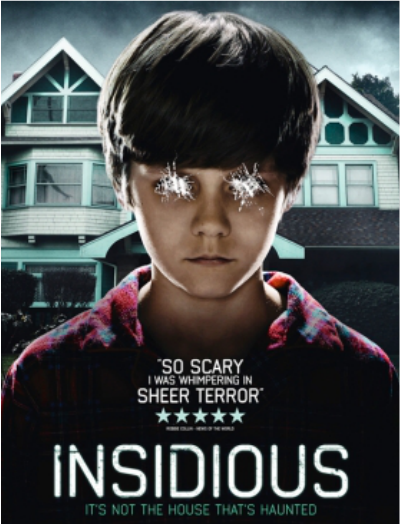
The tagline for 'Insidious' (2010) It's not the house that's haunted' clearly indicates, as well as the picture, that this is a film within the paranormal genre, as it suggests that the boy is haunted/cursed by an unknown spirit or power rather than the house. The house is shown in the background of the poster but the boy is the main focus, so without the tagline it would also be clear to the audience that it is the boy that is under the possession rather than the house.
|
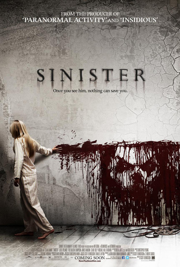
'Once you see him nothing can save you' is the tagline that completes the branding for 'Sinister' (2012). The picture relates to the tagline well as the male that is mentioned allows us as the audience to relate it to the image being shown of a face drwan in what seems to be blood.
T.D |
