Question 4- What did you learn from your audience feedback?
Receiving audience feedback helps us out as a group so much as we can learn so much from them. We get to know what we did well and our strong points throughout the process of creating our trailer, magazine cover and poster. We also get some useful critical commemts from our audience and these are the best types of comments because we can learn from them and go back and improve anything that needs to be changed and if we are to do the tasks again we now know how to do better next time to save us from making the mistakes first time round.
MAGAZINE & POSTER FEEDBACK
This was our original mgazine cover. We wanted to see what people thought of it, did they think it looked like a real cover and was it suggesting the horror theme we wanted to show. We posted the magzine cover on facebook asking people to comment what they thought was good about the magazine and what we could improve. Putting our magazine on social media was a great idea as it helped us a lot. The feedback was very useful and we took the comments in to consideration.
MAGAZINE
|
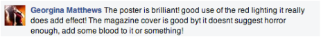
Here are some of the comments we got back from people after we put our magazine and poster on social media. Almost every comment was the same, they all mentioned that our poster was brilliant and the magazine cover was good but it could be better.
Our original magazine cover did not suggest horror as there was nothing on it that showed it. One comment in pacticular mentioned that to make it show horror to add blood to it, we thought this was a good idea as blood would certianly show that this is a horror magazine. Others also said that the magazine cover looked empty and that there was a lot of empty space, it would be better if we could fill it up more like a real magazine cover. |
|
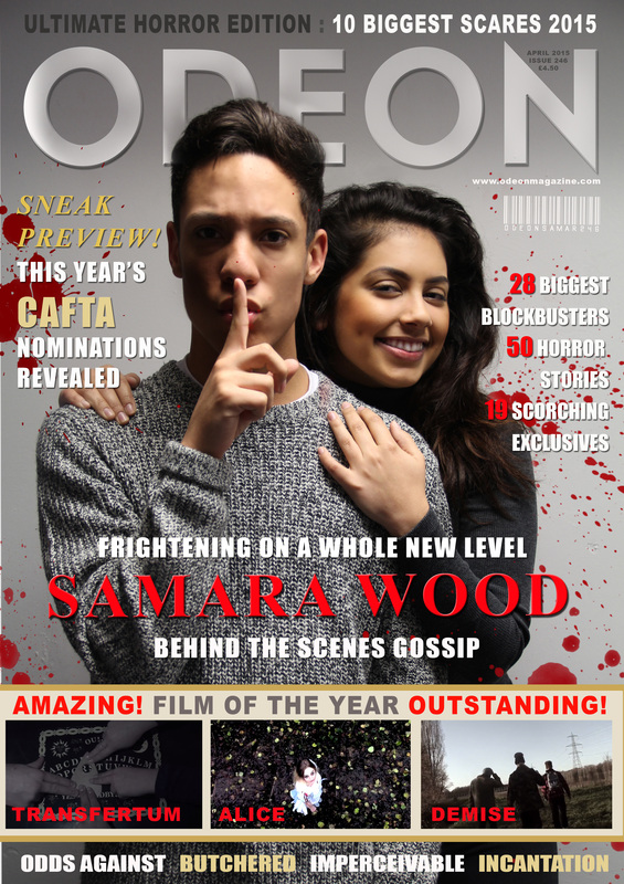
After reading the comments we went back to edit our magazine cover to make the improvements. First thing I knew what we needed to do was get across that this was a horror magazine, to do this I needed to add some typical horror conventions like blood and the colour red to suggest blood and danger.
We added blood splatters in the backgroud of the magazine to make it more appealing to look at as it was very bland before. The blood also added colour to the magazine which made it more eye catching and it also makes it stand out. Our title Samara Wood was originally small and getting lost amongst the rest of the writing on the magazine. I changed the positioning of the title and made it a much bigger size and changed the colour to a bright red in order to make it stand out as much as possible as this is the headline for our magazine.
I also added more writing to the magazine because it was looking a bit empty. Magazine covers only have breif sentenes on them with intresting comments to draw its audience towards it. Selecting certian worrds and changing the colour of them to a more vibrant colour makes the select words stand out on the magazine. For example the if this was a real magazine the top topics in the magazine have been highlighted to stand out. the word "cafta" has been highlighted as that would be an important story.
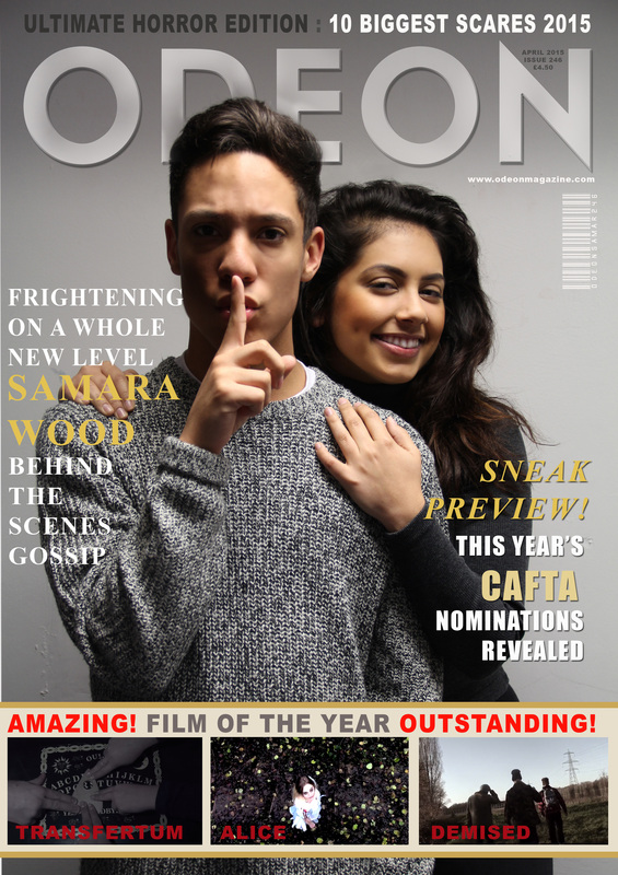
POSTER
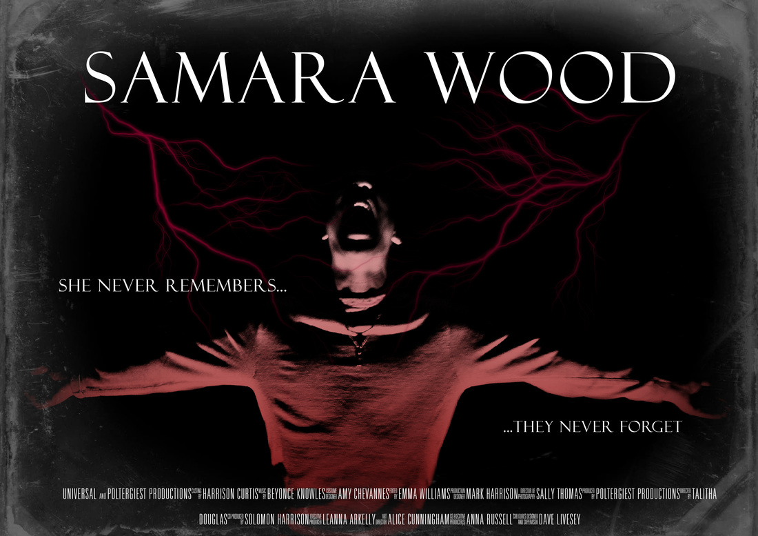
This is our original magazine cover we created. Many people liked our poster and did not suggest many chnages for it but from the comments for our magazine cover after making those changes which were suggested to us we realised ourselves that we could change our poster to make it better and look more professional. Although no one suggested to make changes to our poster getting feedback makes you look at the work you have done in a different way and you start to see changes that can be made and improvements that will boost up the level of professionalism to your poster.
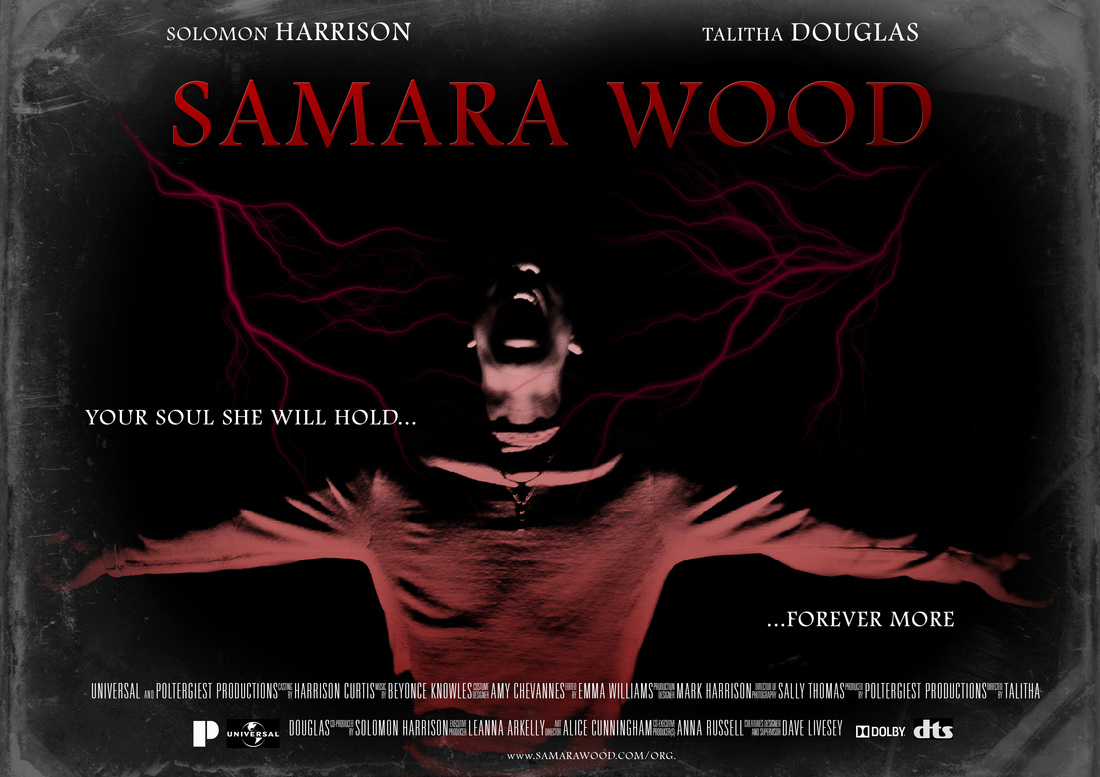
This is our poster now. I went back over it and made a few changes just to make it stand out more and look more profressional. The title on the original poster stood out but only because it was a bigger size, to make it stand out much more I changed the colouring of it to a gradient red. The use of this colour added a sense of evil to the poster! when you read the title now you think that the person who is Samara Wood is very dark and sinister you start thinking of this all because of the use of colour. I also added the names of myself and a fellow group member to the poster as we starred in the trailer this simple thing boosted up the level of professionalism as this is what you find on real exisitng film posters. To make the poster even more realistic I added the logos companies that are relevant to the film industry. The "P" at the bottom of the page is our own logo we made up for our production company "poltergeist productions" this gives a sense of realism to the poster as the logos at the bottom are well known companies which have featured on film posters all around the world. I also decided to change the tagline as I felt that the old one didn't have a good enough effect. The new tagline is a line from the script we wrote and it gives off a chilling feeling as you read it. Its a creepy sentence with a lot of mystery behind it which makes people question what it really means.
TRAILER FEEDBACK
We made people watch out trailer and give us feedback on what they thought of the trailer. We got many comments on the trailer positive and negative comments where made which we appreciated as it lets us know what was successful and what we could of done to improve.
POSITIVE COMMENTS"woah the possessed girls make up is very scary"
"that is amazing how did you make him fly?" "the chilling whispers are freaking me out" "that sound track really adds fear to the trailer" |
NEGATIVE COMMENTS"lighting is a bit to dark"
"the sound gets muffled at times" "it was a very short trailer" "jump scare was a bit predictable" |
Those were some of the comments made by people who watched our trailer. We was so please with the positive comments as we made people feel scared and they said they would definitely go and see it in cinemas if it came out. The negative comments where fine, we took them as constructive criticism and made a few minor changes to our trailer. We went back and changed the lighting in scene where it was a but to dark and turned down the volume on a few scenes where the volume was to loud that it made the dialogue unclear and distorted so we changed the volume level so the sound became clear and easy easy to listen to. The jump scare was straight after the end of the trailer to make it less predictable we added a longer gap between the final scene and the scare so it became less predictable and had more of an effect on the people watching it when it poped up.
